What this proves: I can turn a scattered brand into rules other people can follow, and then produce the finished assets myself, down to the print file the printer needs.
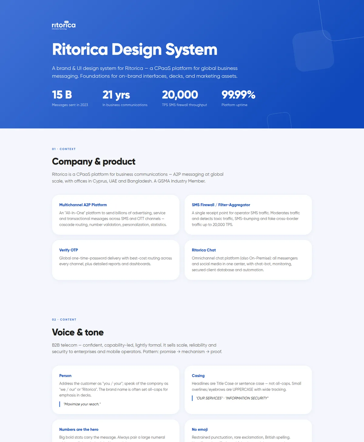
1 hueRitorica blue and its tints, in place of three competing blues and four button shapes
4event-banner directions, built from the same parts
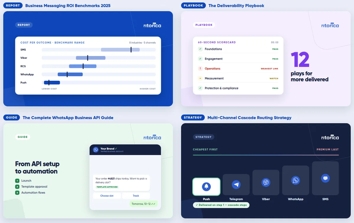
4whitepaper covers, each 1200 × 675
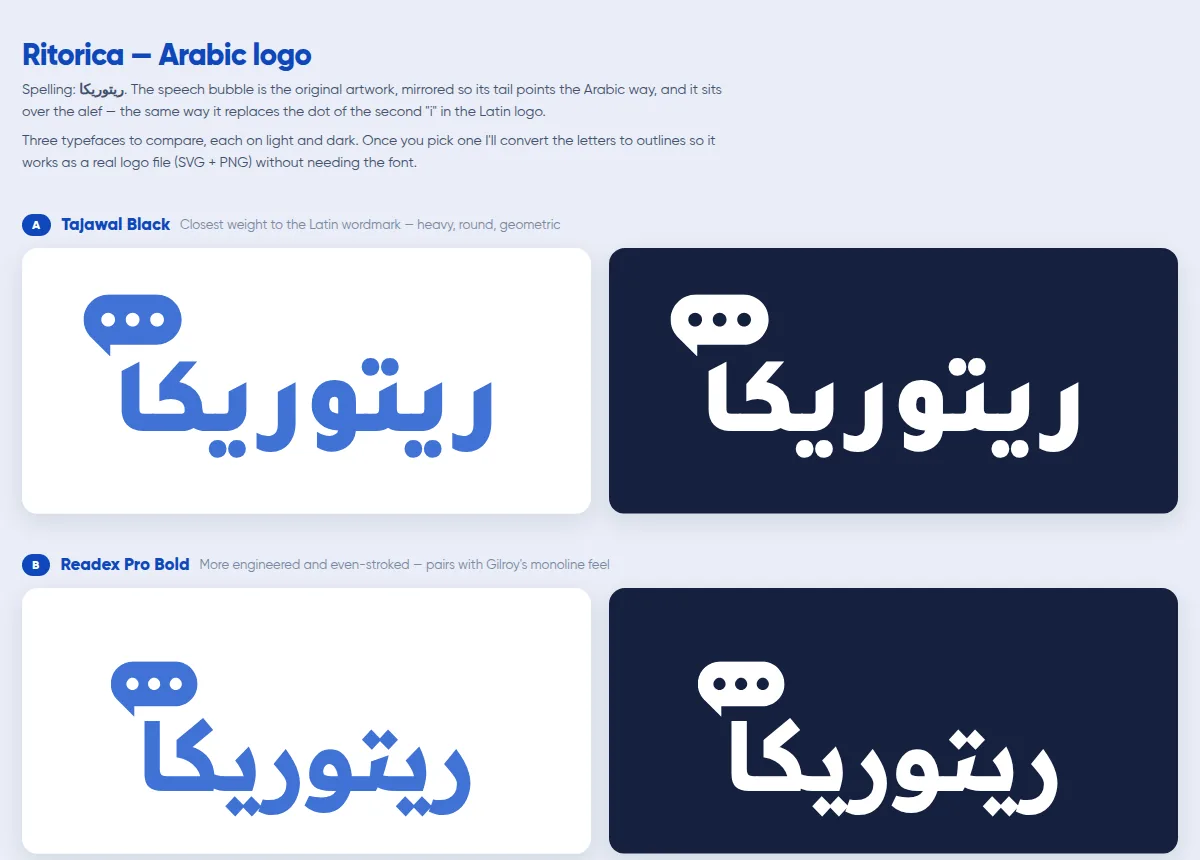
3candidate typefaces for the Arabic logo, letters outlined so it needs no font
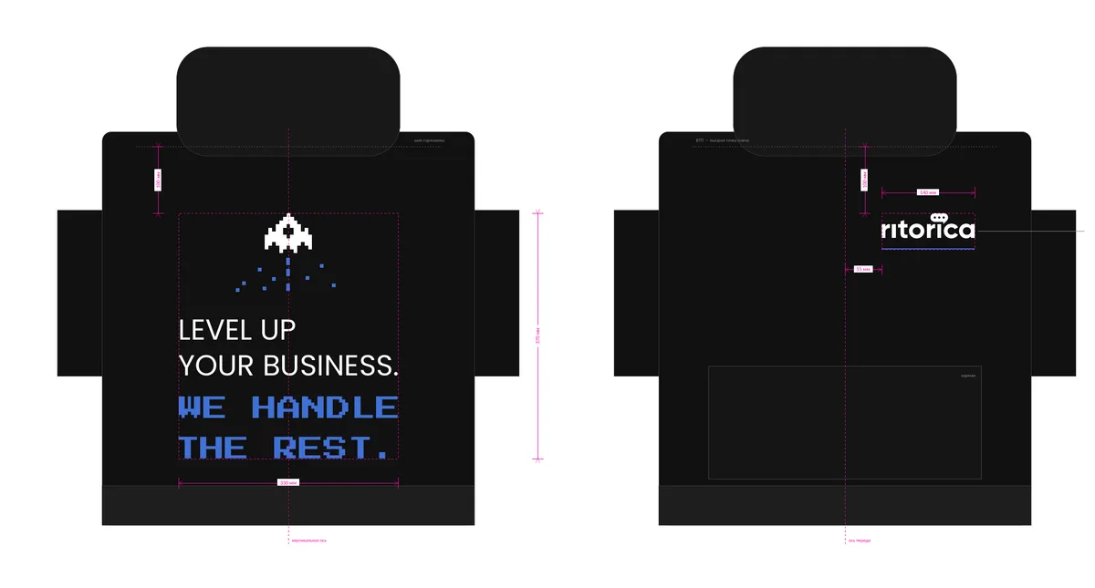
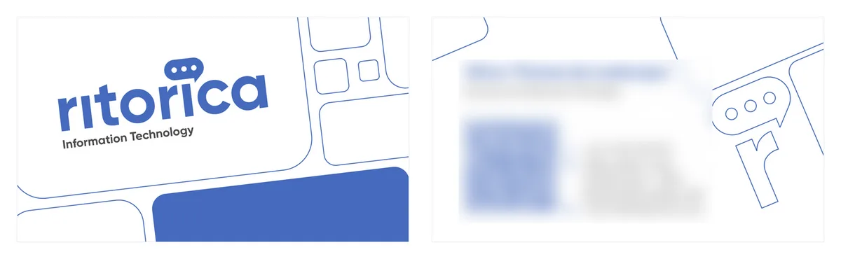
330 mmhoodie back print, with a two-ink chest lockup; cards at 94 × 54 mm
The problem
The brand lived in two source decks and a licensed display font nobody could install. Every new asset was traced by hand from an old file, so each one drifted a little further: three shades of blue, four button shapes, headings in whatever typeface was to hand.
What the system fixes
- One hue. Ritorica blue and its tints carry every accent, chip, chart and call to action, with a single diagonal gradient for heroes and primary buttons. No new hues; semantic green, amber and red only for delivery status.
- Type with a licence-free substitute. The brand display face is licensed, so the system names an open substitute and says exactly where each is allowed.
- Shape and depth as rules, not taste. Fixed radii per element, and blue-tinted shadows rather than grey ones.
- Voice written down. Person, casing, tone, vocabulary, and the pattern the copy follows: promise, then mechanism, then proof. Numbers lead.
- Components, not pictures. Tokens and components in code, so a deck, a landing page and an email start from the same parts.
What got built on it
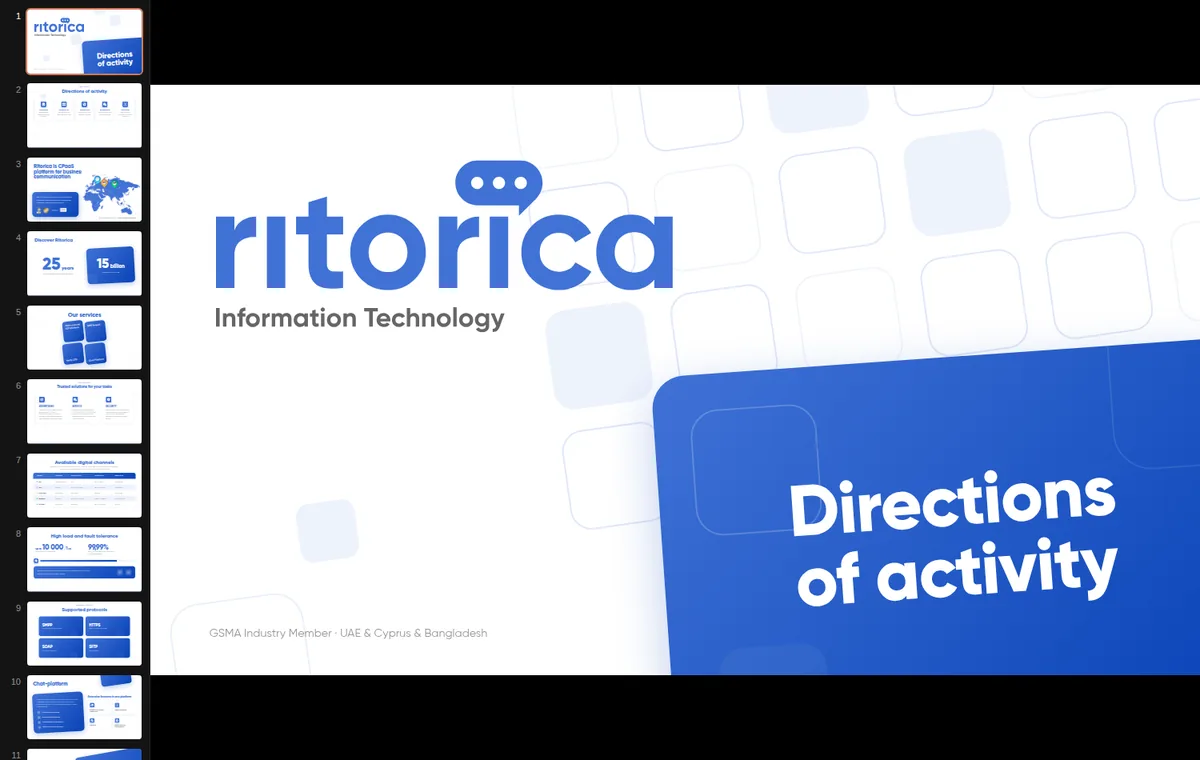
- Slide templates and a webinar deck.
- Four event-banner directions, plus booth material for two international telecom events.
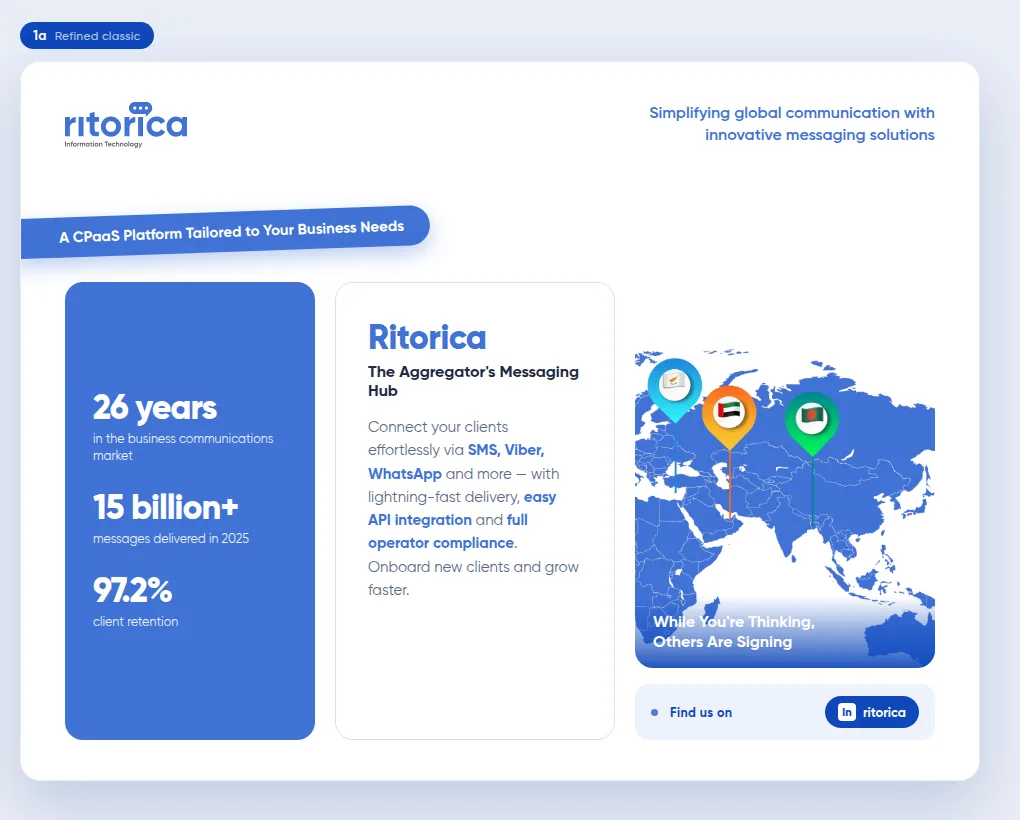
- Email templates, including the whitepaper campaigns.
- Four whitepapers with their own landing pages, each tied to a LinkedIn series and an email campaign.
- Print files: a company hoodie taken from mockup to a print-ready vector at 330 mm with a two-ink chest lockup, and a business-card template at 94 × 54 mm with 2 mm bleed, CMYK and type converted to outlines.
The website in the ritorica.com case study is built on the same system.
What I'd do differently
I wrote the system after the assets, from whatever the old decks happened to contain. Writing the token layer first would have meant less archaeology and fewer judgement calls about which of three blues was the real one.